I don’t know why, but I never really used Delicious.com (actually I had an account a long long time ago). I recently made a new account and came across an interesting UX scenario. It took me like 30 seconds to figure out how to actually make a bookmark (and yes, I was trying, and no, I am not an idiot). Once I figured it out, it was simple, but it got me thinking of an important web principle: “Make your core feature offerings DEAD SIMPLE to find.” While companies probably don’t like getting simplified down to a single feature, that is often what makes them popular. Using a technique from Steve Krug’s “Don’t Make Me Think,” lets see if we can figure out what some popular websites are trying to offer to us. Instead of showing a normal screenshot, each shot has a light gaussian blur applied to it. For me, this is how I often “see” my own work through the eyes of a new visitor. I also came up with some unofficial one liners for each:
Step 1: Create a Call to Action
It’s interesting, because you can find a lot of great design resources and AB tests on “sign up” or “buy now” buttons. However, I rarely see discussion on action items in terms of core functionality of a web application or service. This first caught my eye while reading “Designing Web Interfaces” (pg. 82-83) on “Clear Call to Actions and Relative Importance.”
Youtube: Upload and Share videos
Digg: “Digg”/Rank stuff from the web
WordPress: Write and post blogs
And finally, Delicious: Save and share bookmarks
With Delicious, we see a large blue blob below the logo which is the breadcrumb. We see a large blue blob in the top right, which is the search. We also see a row blue blobs running down the right side of the content area, this is the bookmark count for each post. But what is Delicious supposed to do? To me, there is no immediate call to action and unlike the previous 3 websites, it isn’t obvious how to “do” what I want to do.
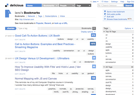
Before: Save new bookmarks by clicking the first menu item in the top right menu. Looking at my recent bookmarks, I think you can imagine what my improvement will be.
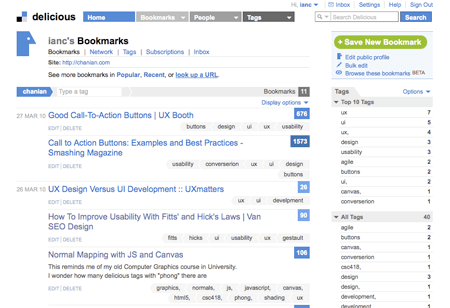
So today, instead of mocking up a redesign, I am trying something new: A Functional Redesign Suggestion. In other words, I wrote a GreaseMonkey script that offers a suggestion to this problem. Before I go deeper, I have to make a disclaimer. I think the Delicious redesign that was done 2 years back is fantastic. Just thinking about “hacking” someone else’s UI makes me uncomfortable. So out of no disrespect to the Delicious team, I offer my suggestion of an incremental improvement on their existing design. With that said, lets jump into the redesign. (FireFox users can install the script here).
Step 2: Make the button easier to click
This may be a bit overkill, but to me, the call to action is obvious: “Save bookmarks or we go out of business!!!” While this small improvement may seem trivial and useless once a user has gotten used to the layout, let’s also look at the long term benefits of such a redesign. Presumably, users will visit the Delicious homepage frequently, and add new bookmarks everyday. Given that the “Save new bookmark” is a high frequency action, a larger button increases the overall ease of use.
This redesign increases the ‘apparent’ target area by more than double. Looking at Fitt’s law for 2D navigation, we can also observe a dramatic change in the index of difficultly of the target. MacKenzie and Buxton suggest using W’ (the length inside the target along the vector of movement) when using Fitts’ law in 2D.
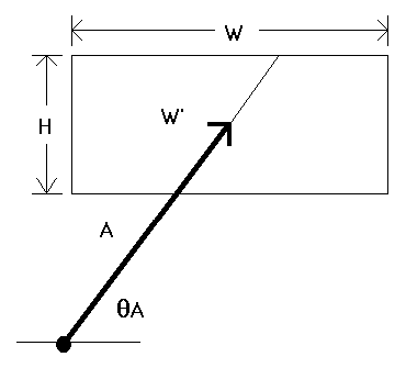
Since we have increased both the width and height, even at a 0 or 90 angle, we improve click-ability
In this model, every increase in height we make, W’ will be dramatically increased. Our goal here is to increase W’, the target area across the vector of movement. In fact, given any θ, Fitts’ law tells us that the time it takes to click this button will be reduced. If this were just ANY other button on Delicious, I would call myself crazy. However this button defines their entire business, and it is hidden up in a menu.
In conclusion, we have easily achieved 2 major goals: The bright green button is very identifiable and easy to see. It is a glaring reminder for users to continue to fuel the website with links (what is user generated content, without the content?). We also make the primary action of this website easier and faster to use. “Just make it bigger”, usually isn’t the solution for everything, but in this case, I’d argue that it is. If a user is going to sequentially add 10 bookmarks, they will do it, with or without this redesign. But merely increasing the size of this primary item, we will statistically reduce the amount of time they will spend moving their mouse towards the button, and in the end: provide a better user experience.
Resources:
Examples of great Call to action buttons
“Extending Fitts’ Law to 2-D tasks”, MacKenzie, Buxton (1992)
“Designing Web Interfaces”, Scott, Neil (2009)
“Don’t Make Me Think”, Krug, S. (2005)




If anyone was curious about the actual increase in productivity with this change (because I know I was!) I crunched some quick numbers:
Assuming the mouse is in the center of the screen, and that we cut into the button at a 45 degree angle:
Before: W’ = 70px
After: W’ = 94px
Using Shannon’s ID log2(A/W+1)
Time to Target:
Before: 303ms
After: 266ms
How about that, Fitts’ law works and we just increased the efficiency of Delicious’ core functionality by 12%!
(oh man, I’m such a nerd)
Good work dude, I agree with what you say. I had the same 30 second “wha-huh?” on Delicious. On the bright side, their extension is sweetcakes.