Archives for category: software

Last night was Democamp26, held at the Ted Rogers School of Management.  There were some great demos that I thought I’d summarize for anyone who missed the event.  I am going to omit the summary of the fantastic presentation by April Dunford, and stick to the demos.  You can find her slides here. To any of the companies that may be reading this, my summary is the impression that I got from your 5 minute pitch, not gathered from your website.  Please feel free to correct any inaccuracies and I’m always happy to see comments.  I’ll also be giving me 2-cents on each project which I intend to be purely for constructive criticism, there are enough trolls on the internets.  Excuse the verbose nature of my posts, this is my blog, I like to ramble.  Without further delay: OpenApps, TeamSave, KoboBooks, SWIX and Status.net

Company: OpenApps
Website: http://openapps.com

Summary: OpenApps is a simple point and click solution for websites to enable user developed apps.  Think Facebook apps on your personal blog or company website.  The value prop is that not everyone can afford to build new site functionality, and their technology can easily allow developers to create apps for others to consume.

Presentation: This presentation was great.  Fast paced and straight to the action. Krispy (the presenter) clearly has talent for presenting and genuine enthusiasm for the product.  His excitement kind of felt like what it would be like if the ShamWow guy made software (I mean that as a compliment Krispy).  Big Kudos to their team (who were all present and proudly wearing their company gear) for launching on stage last night.  As someone who has been part of a live on-stage website launch (I was lucky to be at TechCrunch50… name drop… *cough cough*) so I can totally relate to the pressure the team must have been feeling.  During the 15 second Wireless Internet drop, I glanced over at the dev team in the audience who were all equally relieved when the Wireless kicked in again, I shared their relief.

Killer Feature: 2 killer moments during the presentation.  Their apps magically* sit on a sub-domain of your company URL (search.democamp.com) and the “Look and Feel” easy button which essentially auto-styles a vanilla app install to your caompany’s layout.  Thats a neat trick.

Comments: I got the idea, the demo made it pretty easy for people to get.  The business model is pretty clear to me, they take a 30/70 split in favor of the developer on the apps.  The apps have a monthly fee and its a win-win for small companies and independent software developers.  My only concerns is that their review process will likely run into similar problems as the Apple App store, and the responsibility of service and uptime of each app is really up to the developers.  Now this makes sense for OpenApps, because they could not feasibly support all these user generated apps, so companies must understand that most of the apps will have an “as is” tag stamped on it.  I caught up with Krispy after the presentation who reminded me that they aren’t in the business of hosting applications (though I believe they can, with a cost), they are in the business getting cool apps on peoples websites.  At the same time they are giving developers a distribution platform for their apps, and helping them make money.  +1 for helping developers out.

*Don’t worry, I’ve done the old “host file” hack many many times in demos.

Company: TeamSave.com
Website: http://teamsave.com

Summary: Companies give better deals when you buy stuff in groups.  It ‘s hard to get people to commit to group buys.  Squeeze people to a 24 window and people trying to get the deals will become your sales force.  Cool.

Presentation: I like these guys a lot.  We got a 2/3 life lessons and 1/3 demo which I liked (although I’m sure some didn’t).  I am young, in a start up and trying to make great software that sells.  These guys are all of the above, so the presentation was great for me.  This duo was featured on the hit TV show “The Dragon’s Den” where they successfully pitched JobLoft.com  and eventually sold it to onTargetJobs.com.  Hearing these success stories is always nice.

Read the rest of this entry »

Advertisement

I don’t know why, but I never really used Delicious.com (actually I had an account a long long time ago).  I recently made a new account and came across an interesting UX scenario.  It took me like 30 seconds to figure out how to actually make a bookmark (and yes, I was trying, and no, I am not an idiot). Once I figured it out, it was simple, but it got me thinking of an important web principle: “Make your core feature offerings DEAD SIMPLE to find.” While companies probably don’t like getting simplified down to a single feature, that is often what makes them popular. Using a technique from Steve Krug’s “Don’t Make Me Think,” lets see if we can figure out what some popular websites are trying to offer to us. Instead of showing a normal screenshot, each shot has a light gaussian blur applied to it.  For me, this is how I often “see” my own work through the eyes of a new visitor.  I also came up with some unofficial one liners for each:

Step 1: Create a Call to Action

It’s interesting, because you can find a lot of great design resources and AB tests on “sign up” or “buy now” buttons. However, I rarely see discussion on action items in terms of core functionality of a web application or service.  This first caught my eye while reading “Designing Web Interfaces” (pg. 82-83) on “Clear Call to Actions and Relative Importance.”

Youtube: Upload and Share videos

Notice the bright yellow blob in the corner -- the "Upload Video" button

Digg: “Digg”/Rank stuff from the web

Notice the 3 yellow/tan blobs running along the left - "DIGG" buttons

WordPress: Write and post blogs

Notice the blue blob on the right - the "Publish" button

Read the rest of this entry »

I love the color pink/purple - I change my syntax highlighting colors so that I comment more...

One day, a software developer was walking down the street and came across a large pill of dog shit.  He bent down to get a closer look and said to himself “yep, that looks like shit”.  He then gave it a sniff, and said “Yep, that smells like shit”.  He then put his finger in it, and said “Yep, this feels like shit”.  Finally he did the unthinkable and tasted his finger and happily said: “Oh yeah, that tastes like shit…”.  He then walked away satisfied, and said out loud:

“That was definitely dog shit.  Good thing I didn’t step in it!”

An old joke which I managed to re-arrange and fit into my experiences with software.  Sometimes you have to taste the shit to avoid stepping in it. Don’t look too deeply into the metaphor.  Testing is hard, not everyone wants to do it, but it is your duty to prepare for and handle the worst, so your customers don’t need to.  I guess there is a hidden message about thoroughness too.

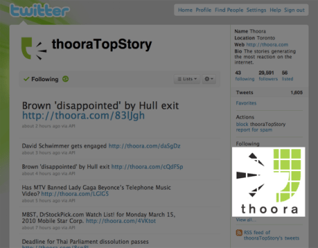
I have seen some absolutely stunning Twitter wallpapers and one thing that always sparks my imagination is living in a world of constraints.  Twitter gives everyone the same template, and lets us change colours, background images, but that’s about it.  When we, (myself, @kenstruys and Jason Tigas) were developing Thoora’s company twitter feed, we wanted to do something cool.  There was one area on the Twitter profile page we had some control over, even though most people wouldn’t think the control exists:  Recent Followers, and the Twitter mosaic was born.

So.... who has your company followed recently?

And just in case you missed it:

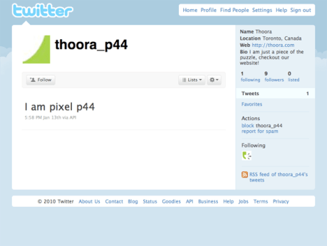
Now we did what we could, and Twitter so graciously gave us a nice 6×6 grid to work with.  So 36 Captcha’s  later – we had our very own custom module on our page.  We played around with having a mini version of our site embedded into the mosaic (each tile linking to the twitter account of a subsection of our site) but it seemed a bit overkill. Our Creative Director wasn’t too thrilled with kerning on the letters: t-h-o-o-r-a, but I really wanted to push the company name out there.  We were also able to nicely squeeze our logo mark (the thoora man) nicely into the grid.  For those curious, here’s a shot of one of the tiles:

All accounts are public, so feel free to mosaic your own page with us ;)

So that was a nice little afternoon hack which we put together a few months back.  Yes, I realize there is some branding inconsistencies here:  The logo mark is chopped up, the kerning is all wrong on our font… but the Thoora man got stuck in people’s head, and that’s what we wanted.  So here is a quick app idea, create a pixel account for every color in the RGB spectrum, then make an interactive tool allowing users to draw whatever they like in their “following canvas”.  If you make it, I’d love to try it out!  (Although the 24^2 * 36 pixels is a hell of a lot of Captcha’s).  Lastly, if you were wondering, we wrote a script to follow the accounts in order, so we are 1 line away from having a branded Twitter account. Thanks to David Billingham (@slawcup) for the PHP API wrappers. Usage: php script.php username password

Read the rest of this entry »

Every so often, I see an idea that really catches my attention.  About a month ago I found out about the website http://chatroulette.com which is a website that connects you to a complete stranger via webcam.  The idea is dead simple, but it has achieved explosive success.   While the service itself (to me) is pretty useless, it is an incredible example of a simple idea captivating a mass audience.  More specifically, this website is achieving monstrous growth which is certainly worth looking at.  In this post I will look at reasons why I think it is succesful, but also reasons why it won’t last.  Feel free to check it out for yourself (NSFW warning issued).  I will not review the site itself, because it has been done many times before.

What was so different?
Internet users are used to living in a comfort zone.  We constantly use the same website over and over again and anything that deviates from our regular usage pattern raises alarms.  We make baby steps towards change.User generated content was useless at first, now we have Wikipedia.  Facebook updates seemed to be “too much information” and now we have Twitter.  But sometimes, things arrive that really break the mold, and it catches our attention.

Based on a visual I first saw presented by Mark Watson with UofT's HCI group

A quick visual of how I interpret different communication platforms.  I think “depth” is the wrong word, although “fidelity” doesn’t really work either.  What I intended on the Y axis was how much the conversation mimicked a meaningful face to face talk.  Omgele is a website allowing quick random 1on1 chats.  Complete stranger, short conversation, very little emotional connection.  Chatrooms have a similar model, but they can turn into more meaningful conversations and relationships.  MSN/Chat programs involve personal conversations with whitelisted contacts (as opposed to random people).  Email (for professional use) is usually limited to an even smaller whitelist, and the conversation is more professional*.  Lastly, Skype offers a free video/audio chat application that allows me to have face to face talks with people I really choose to have face to face conversations with.  Now this is a gross over simplification of most of these mediums/applications, however the graph represents the type of interaction we are used to and comfortable with.

*I must digress here noting how terrible it is that email now a days contains some of the highest quality writing I see online.  When I have friends squeeze messages into 140 characters for Twitter it makes the part of me which strives for better writen[sic] English die a little.

Chatroulette broke away from this mold, and presented us with something that was different, it was wrong, it was uncomfortable.  But it was interesting, and it was new, and it fed the desire to have “realtime” content to the extreme.  And it was successful:

[Live data, this was posted March2010, which showed strong growth for 3 months straight]

Why was it ok? Why now?
-Flash recently enabled peer to peer webcam data transfers, which meant no heavy server costs to support video chat: a pet project turned successful
Years of use of social media has conditioned internet users that talking to strangers is ok, even on webcam
-Webcams are now a commodity on new laptops, lots of people to chat with
-highspeed internet is now common enough that we can assume users will be able to handle it

What made it popular?
-The next button – never before have we been so demanding for instant results satisfaction.
-The shock value – you never know what is around the next corner
-The quick fix – you are always one click away from peeking into a complete stranger’s life

Why won’t it stick?
Now I can’t imagine that they’d ever expect the website to be such a a hit, but there are still some problems they will deal with.  You cannot use this website at work, and the big NSFW barrier will prevent a lot of day time traffic.  Why is it NSFW?  Well if you have ever used the website, you will know why.  That itself will cause some problems, as the amount of male nudity likely makes most people run for the hills.  There is also a general lack of stickiness to the service itself:  why come back?  My experience today is no different than my experience tomorrow.  There is no advancement, there is no inbox to check.

Site of the week?  Probably site of the first 2 quarters of 2010 (although with some updates, I think they can really do something with this).  But the lesson learned here for me is priceless.  Thinking outside the box, or at least, breaking away from the existing mold creates something that people might like.  Although I wouldn’t claim that my graph above is completely accurate, traversing it helps you easily come up with some great app ideas.  Chatroulette was really just a cross between Skype and Omegle.  I have seen so many Twitter clones, or Facebook clones.  Google Buzz even seemed like a lot of existing ideas mashed into one.  My hat goes off to Andrey Ternovskiy who, possibly by pure accident, came up with the first fresh idea I have seen in a while.

I made an analogy once a while back about error pages on websites.  When you are browsing a nice website and you get slammed with a default or ugly error page, it is like going to a really fancy restaurant only to find a really terrible bathroom.  Now this may seem like a really weird analogy, especially because I have seen some really nice bathrooms before, but ignoring this issue can really disrupt a nice meal, or for web users, can really disrupt their user experience.

Where did all my pretty colours go? I just wanted to watch cat videos!

Ideally, if someone typed in a URL wrong, or heaven forbid clicked a deadlink on your site, I think it is only fair to quickly explain the problem and help them along their way quickly.  Remember, arriving at error pages is a frustrating experience.  Your user did not mean to get there, and the customer is always right, so it is your job to apologize (if you choose) but more importantly comfort them so they don’t just leave.  By maintaining the same look and feel, the users don’t have the huge context switch that they might experience on a default error page served by Apache or IIS. This is how we handled it at http://thoora.com (Yes I’d like to think we are somewhat fancy)

Maybe not as fancy as the bathroom at the Ritz, but hopefully it shouldn't ruin my customers' meal

Note the link to the main page which quickly ushers them back to the regular service.  Now more and more you tend to see graceful error handling, but I think it is good not to go overboard.  If we don’t clearly illustrate that an error has occurred the user might not even know that something has gone wrong.  Now arguably one could say that hiding errors from users is good if possible, but if we encounter a 404 and the resource literally doesn’t exist, we should tell them.  I have seen error pages that look exactly like other pages, so over designed it is hard to tell what is going on.  Similarly, I have seen pages that treat a missing page as an invitation to serve me something completely different (although I might not be completely opposed to a recommendation of similar alternative pages).  When something goes wrong, let them know and help them recover gracefully.  This is especially true for the other type of visitors on your site.  The visitors that probably visit more often than you think, and really care about these dead pages.  The robots.

While decorating a bathroom, and having a guy handing you a towel is great, you still have to call it a bathroom.  If you don’t, Google (et all) will be constantly directing some of your traffic straight to your bathroom instead of your dinning area.  The robot needs to know that something bad happened and Apache (and most web-servers) will serve them the correct HTTP response code for you.  I can’t talk about this without thinking of an old commercial I used to love.  I laughed so hard every time I saw this (its been years since this campaign was run). Below is a screenshot of Firebug capturing a nice 404 back from a server. This lets your browser know, and more importantly the spiders/robots know that even though it looks nice, something went wrong (Tim Berners-Lee would be so happy).

Bots aren't as smart as (most) humans, they need help from time to time

So if you are going to fail, fail gracefully.  And if you are going to customize your errors, make sure you don’t forget about the robots.  On a side note I encourage all to use Google webmaster tools to see what the spiders are tripping on.  Google is great at finding links you didn’t even know existed on your site ;)

Further reading: ISBN-13: 978-0735714106

Well, Google Analytics is actually free, so I guess that title doesn’t make much sense.  I have reused this code so many times I thought I’d share a small Bash snippet for quickly getting unique visitors when poking around your webserver.  Run inside the Apache logs folder, should work for most versions of Apache too.  (I felt the need for a micro post after those last two monster posts).  You can add stuff after the GET to get more specific.

cat access_log* | grep "GET" | cut -d" " -f1 | uniq | wc -l

Or we can also quickly see who is looking at the most stuff. Note this is absolute resource requests, not page views.

cat access_log* | grep "GET" | cut -d" " -f1 | uniq -c | sort -n | tail

Part2 of my follow up from Cusec2010, regards Douglas Crockford’s talk on “The Software Crisis”.

Short version for those headline skimmers:  Crockford says that the Software industry is in a state of crisis, we need to fix it and we must fix it.  I agree with all his recommendations and examples of flaws in our industry, but I argue that it isn’t  necessarily a flaw but an inherent relationship between the software industry and the business world.  Buggy software is often good enough, so lets just try to make it a bit better.

As a precursor to this talk, for the last few months I have been thinking about a similar (if not the same) problem: The software crisis. I had been talking with friends about something that bothered me about the software industry, imperfect code, imperfect process, the imperfect software industry.  When Crockford stepped on stage and showed his first slide “The Software Crisis”, without him even continuing, I knew exactly what he meant.  First off “Thank you Douglas for putting a name to an issue for me”, it was like remembering the lyrics to a song for a week without being able to remember who sings it.   His talk was on aspects of the crisis, why they exist and how we can minimize and pave a brighter future.  He had my attention….

I won’t go into the dirty details of the crisis itself (a quick google search should help you with that), but in short: we are getting lazy, we are producing bad production code, we are delivering late, we are testing too late, we are in major trouble.  Why does this happen, and what can we do?  Crockford opened by stating that creating software is the most complex task a human being can do. (Paraphrased, someone please msg me if you can remember the exact quote)

Read the rest of this entry »

Why are things always so obvious after disaster happens, I think they call that hindsight

One of the final talks I attended at CUSEC 2010 in Montreal, was probably the most important, and unfortunately – (seemingly) the most underrated. Daniel Berry from University of Waterloo Software Engineering gave a talk entitled “Ambiguous Natural Language in Requirements Engineering”. Unfortunately he was speaking to an audience in the Agile area who have been exposed to culture stating that Waterfall Software Process is dead. More inaccurately, that requirements gathering is a dead science. This talk was not only enlightening, but also made me rethink many topics I haven’t thought about since University.

In summary for those who don’t want the verbose version: The process of transforming the ‘idea’ (as a requirement) and turning it into ‘code’ is a problem that extends well beyond just the ‘code’ part. Many software errors (%5-%10) are a result of ambiguous requirements – Requirements that neither party in the process even knew were ambiguous. This talk was a branch of Software Engineering shining at its best – and Berry offered solutions!

First to address those developers still pretending this problem doesn’t apply to them: Not all software projects involve 1-2 developers. Not all projects allow you (the developer) to talk directly to a client. Some projects will have you writing code based on requirements written by someone else in your company. This problem exists whether you want to believe it or not.

Read the rest of this entry »

This post will probably make people think I am insane for bring up such a small issue.  But little things bother me, and this little thing has bothered me for years, and I have been waiting for Microsoft to fix this.  No matter what email client you choose to use, there is a set of basic features that all must support.  Once you start looking at competitve advantages, little features make the difference.

Target for today’s discussion: Windows Live! Hotmail

As a synopsis (to those who don’t want to read the whole post): Unlike all of its major competitors, Hotmail does not allow users to mark emails as unread within the context of reading an email.  As a secondary, they provide buttons that don’t actually do anything.

I will also look at some competitors: Gmail, Yahoo! Mail, and Facebook’s Message Inbox

The left navigation area of 4 popular message/email clients

I use a lot of email clients, gmail/hotmail mainly.  I also use 2 other lesser known clients but mostly to keep up on innovations in the UI etc.  Over the years, (after gmail came out) Yahoo! Mail seemed to be the only client that made improvements or drastic changes to their interface.

I took this above screenshot because it demonstrates how I (and many others) use email.  I generally try to keep my email box with 0 unread emails.  As it gets closer to Friday my work inbox sometimes gets up to 10, but I am pretty good keeping it low.  When I read a message and realize it is too long to read at the current moment, I mark it as unread.  Similarly, if there is an important email, with vital information I will need in the near future, I will mark it as unread.  Some clients allow the ability to mark or flag as important/follow up.  Most clients allow folders for organization.  Depending on the user’s level of organization they may have their own way of dealing with such messages.  Personally, I like to mark anything as “unread” until I have fully closed off all ties with that particular issue.  It is the one thing that at the end of the day, reminds me there is something outstanding (The big number beside my inbox).

Read the rest of this entry »