Archives for category: rants

ferran

Looking beyond Silicon Valley for product leadership, vision and inspiration

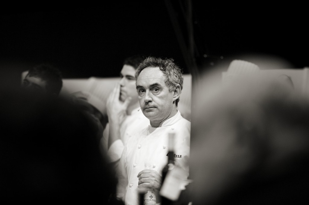
Never have I seen a product mind in motion so interestingly captured than in the 2011 documentary “El Bulli: Cooking In Progress”. The film, about one of the most decadent, highly rated and progressive restaurants in the world, featured world famous chef Ferran Adrià. Leading a world class team of chefs and service, Adrià is portrayed as a detail obsessed leader searching for the impossible – perfection.

A team “standup” is depicted, where each member of the large group described their name, specialized role, and by the request of Ferran, their previous employer. A young woman casually announces her name, and that she previously worked for Jose Andres, another world famous molecular gastronomy chef and former student of Adrià. The pedigree and composition of his staff was not too different from the waves of ex-Facebook and ex-Googlers in the Valley who gather and successfully form new ventures.

Ferran embodied a very polarized depiction of the characteristics I’ve seen in founders and product managers during my admittedly short ~10 year career writing software. He was a leader, he was a visionary, and he inspired his team to build. He obsessed with detail, process and documentation. This obsession was highlighted in a scene where a damaged hard drive lost a week’s worth of food experimentation data, he (like any good data informed PM) was furious.

He encouraged and innovated directly through experimentation. He tasted and tested constantly. He obsessed about both the macro details (the flow, the entire meal, the timing, [the user experience]) as well as the micro (the physical plates, the garnish, the exact amounts of flavoring down to the crystal of salt, [the pixel level detail]).

He insisted that new menu items would only be served to tables of two, and then slowly integrated into the main menu once they’d iterated, verified and truly perfected the dish. This part of his process really stood out to me because this controlled release process is no different than how we release new features at Twitter. While this might be a very standard and obvious process in the culinary industry, I was surprised and impressed with this strategy.

But Ferran also ruled with an iron fist. He had very little patience for failure. He was seemingly short tempered, impatient and stubborn. These characteristics reminded me of the description given by food critic Masuhiro Yamamato of Master Sushi chef Jiro Ono. A strange cocktail of otherwise negative characteristics that result in a close to perfect product. And while I’ve commented before about how the film Jiro Dreams of Sushi was more about engineering diligence, El Bulli was about the audacity to reach product perfection.

To be clear, Adrià’s impatience was only for sub-par quality, rather than an expectation for instant satisfaction. He electively closed his $350/person restaurant for 6 months of the year to spend time researching and creating his unique menus. He would, however, scoff and raise a fit when served a food sample from his staff that was not to his liking.

The “climax”, so to speak, of the film draws to a conclusion with Ferran sitting alone in the restaurants’ kitchen. Though surrounded by his 40 staff members and a full restaurant of satisfied customers, he might as well have been on the moon, alone with his thoughts. His unheard, yet likely inner monolog being: “It is not good enough, I can’t serve this to my customers”, the irony of course being that it was a 3 Michelin starred restaurant at the time. Omitted from the film was the unfortunate reality that such a strict disciplined approach was not sustainable. El Bulli sadly closed shortly before the film was released due to financial stress the process and 40+ staff likely put on the restaurant. This unfortunate fate, however, came only after Adrià successfully ran the restaurant for 24 years, whilst topping the lists ranking as the best restaurant in the world. The following observed qualities lead him to success, and perhaps the last one to his demise.

  • complete respect for quality

  • intolerance of the mediocre

  • inspired, and lead fearlessly

  • relentless experimentation and iteration

  • total willingness to reinvent

  • obsession with perfection

Maybe creating software has no comparisons to a world class Michelin rated restaurant. But as a food lover, and also software engineer, I’d like to romanticise and draw parallels between the two. Regardless, there are many lessons to be learned from observing Mr. Adrià’s legacy in motion. Perhaps we don’t all need to have an obsessive quest for perfection, but then again, if we aren’t serving out our absolute best dish, what is the point?

[photo credits: http://vcrown.com/]

Advertisement

What circles do you think you have been added to?

tldr:
Google+ introduces a new type of privacy problems which I can only describe as the inverted personal privacy dilemma. It is no longer an issue of “What I choose to share with Google and then what Google shows to others”, the issue is now: “What friends/complete strangers choose to share about me to Google, and my inability to do anything about it”. The responsibility of maintaining my personal privacy has been partially removed from my hands, and placed in the hands of the people of internet.

Thought experiment:
Put 100 privacy aware/concerned people into a room. What would you suppose is the best way to create a global interest graph/taxonomy for this group of individuals? Algorithmically? Manually? First, ask them to fill out very basic personal information about themselves. We will probably have reasonable success. Next we ask them to fill in very specific personal information/categorizations about themselves. How do they react? Probably not as successful. Now ask the same group of people to write down and categorize the people around them, but remind them that their categorizations will remain secret. Each individual’s privacy has been maintained, and collectively we have created a very rich interest graph/taxonomy which is possibly far more accurate than any automated solution.

Read the rest of this entry »

Screenshot from movie trailer: And yes, I realize there is now a fake FB account this *character* in the movie...

Spoiler alert, I don’t really talk too much about the actual film’s “plot”, but if you haven’t seen it, watch the trailer here – watch the movie in mid September, and then come back.  I am not going to reveal the *twist* ending, go pay and watch the film. I was very fortunate today to be invited to a screening of the new movie Catfish.  It is a new documentary/reality-thriller about an online relationship that goes sour.  I knew very little about the film other than a very intriguing trailer that was floating around YouTube.  The film was quite enjoyable, and it did prove to be the emotional roller-coaster as promised, however there were a lot of mysteries behind the nature of the film itself.  In this post, I wanted to outline what I found fascinating about the  film, what I found unsettling about the film, and address the biggest question surrounding the movie:  Were the events in this film was REAL or FAKE?

Read the rest of this entry »

As a summary, this post outlines some good-to-know things for any Canadian software developer thinking about moving to the US to work.

Pretty bizarre tutorial no?  But after going through this experience (just shy of 2 months ago) I realized that there are a lot of things I wish I had done / known before.  A recent visit from a friend from Toronto had me thinking that others may benefit from a post like this.  This info is specific to San Francisco, however I am sure it applies to many other cities.  I have to thank @bentlegen and @shazow for the advice I got while moving in, I intend to pass the baton.  For a great post on how to decide where to work (if you are fortunate enough to have options), checkout @shazow’s post on: A check list while considering offers.  This post outlines all sorts of issues I ran into, feel free to skip ahead to the parts you might find useful.  I will cover things like: getting a visa, finding a place to live, and how to efficiently spend your first week in the city.  As a disclaimer for all the immigration advice, this is just through my experience.  I am not an immigration lawyer and if you have specific questions, I suggest you consult one.

Read the rest of this entry »

The infamous TN1-VISA: Its like Willy Wonka’s golden ticket, except this one lets me legally work in the US.  I took this photo 5 minutes after walking out of the US customs office in YYZ

(for tips on what to do/expect when making the move yourself, checkout my other post here)

I recently moved from my home town of Toronto, Canada to downtown San Francisco.  A lot of people have asked me why I moved (other than the job) so I thought I’d write a quick post about my move.  Over the next few months I will also be publishing weekly (hopefully) updates about my journey into the heart of the tech world.
Read the rest of this entry »

Over the last couple of weeks I have been trying to formulate a law based on my experiences over the last 8 or so years writing software for companies.  I think I have almost nailed it.

The Keyboard Law
(or The New Keyboard Law):

The total amount of unnecessary time elapsed between a developer requesting a new keyboard, to the time when it arrives in their hands, is directly proportional to the amount of bureaucracy within the department or organization he/she works for. As a corollary, this time is inversely proportional to the amount of influence software engineering experience has within the upper management of said company.

[Warning, below I go on a long rant explaining this law, feel free to skip it and just use this law in practice and give me credit,fame and fortune in the future. Also skip to the end and add your comments too ;P]


Read the rest of this entry »

I find myself using delicious.com more and more (yes, I was a very late joiner).  I read so many random blogs and articles and always feel bad when I forget where I got an idea from.  I have been using delicious as a reference to my brain, the tagging system makes things really easy to recall.  But the thing that always gets in my way is their tagging system, space delimited.  Since delicious only accepts “spaces” rather than commas, I was frustrated one day to find duplicates of some of my tags:

And no, there is no such thing as "ui,"

I couldn’t imagine myself being the only one with this issue, 5 seconds of Googling uncovered this 3 year old thread about the problem.  My usual greasemonkey disclaimer applies (I love delicious, and I allowed 3 years for this to be fixed, so I will make a patch if people choose to use it).  So, better late than never, this one is for you @stowboyd!

Install the GreaseMonkey Script Here

I must assume that all airplanes run Windows2000

Inspiration behind this comic, I recently flew from Detroit to Toronto and the plane refused to take off because the kid beside me was writing an SMS.  2 different stewards began arguing with him to turn off his iPhone until he finally did.  Meanwhile I was *sleeping* beside him with my iPhone on listening to music.  Fortunately for me, I had my hood on and they didn’t care notice.

“Phones and Mp3 players can cause electrical interference that can disrupt our plane’s equipment.”  I don’t like being treated like a child, the reality is they need your full attention during takeoff/landing so that you are alert, since these are the times most likely an accident could occur.  Just say that.  You can’t seriously expect me to fly on a plane if some idiot’s Walkman (that idiot was me in my previous story) was accidentally left on, and can take down a 747.  Why do you rigorously measure the amount of hair gel in my carry on, and force me to put it into a baggie, yet seemingly ignore the 3 electronic devices in my front pocket.

Incidentally, while drawing this comic, this news article about an NFL player going through this exact debacle appeared in my news reader.  I might be over reacting, but perhaps you (the FAA) should worry more about your pilots making $17,000 a year and being on food stamps [warning, link to Michael Moore] than me listening to Miley Cyrus on my flight home.

"Shadow of the Colossus" by Team ICO, image by fellcoda from deviantart

Summary for all those headline skimmers: Ebert says that video games will never be art, I highly disagree and analyze and break down his argument.  Ebert seems to have confused the act of playing games with the creation and the game itself.  The original article spawned a huge reaction, and > 3,000 comments.  Many ideas from those comments are shared by me.

A week ago, acclaimed film critic Roger Ebert posted an article boldly re-stating his belief that “Video Games can never be art”.  His article was in response to a TEDx presentation by Kellee  Santiago defending Video Games as an art form.  Ebert’s argument hit a personal note, because although his focus was video games, to me it almost generalized that no part or product of the software process could be art.

Ebert’s main argument focused on a traditional definition of art, and used the 3 examples provided by Kellee as counter-examples for his proof.  This made me cringe.  Presenting an argument in this form (specifically relying on these 3 examples) to me was a logical fallacy, denying the antecedent.  Video games will never be art, because these 3 games are not art.  Sorry Ebert, you get an D- in propositional logic 101.

To his defense, I don’t feel like these were the best examples to use.  The Waco Resurrection, was a very interesting but bizarre choice to prove a point.  Any academic trying to solidify the credibility of modern video games knows of the stigma that must be overcome to make any progress.  The Jack Thompson‘s of the world  have made it impossible to mention video games seriously without getting the “senseless violence” card thrown on the table.  I acknowledge the original ‘artistic’ intent behind the Waco project, but again, very very bizarre choice to make a point.  The other two examples weren’t as bad, but Kellee quoting their market success just gave Ebert more ammunition.  There are so many other facets of the game industry that could have been brought up.

Ebert seemed fixated on the gamers’ desire to have playing games qualified as art.  This is the biggest problem in the whole debate for me. He unfortunately failed to see that many disagree with his position because the process of making a game, and the game itself is what people want to be considered art, not the act of playing. And instead of starting a fight with an audience, he started a fight with an entire industry. This comment (lost in the mass) by Ebert himself, sums it up.

By jim emerson on April 17, 2010 12:36 AM
Would you concede that a chess set itself can be a work of art, whether or not it is actually played?
Ebert: Yes. But why is that a concession?
The screenshot above is from a PS2 game, “The Shadow of the Colossus”.  I own this game, never played it to the end, but before I even bought it, I considered it a piece of art.

I always feel uncomfortable taking photos in airports

I often (wrongfully) ignore great examples of UI design outside the computer world.  While making a connecting flight in Vancouver, I stopped to take a picture of this (in my opinion) great “User Interface”.  It reminded me of Tufte’s Envisioning Information, although I’m sure there are many other books which better exemplify this point, maybe this one.

I am always reminded of an interview question a friend had a few years ago while interviewing for a PM position at Microsoft: “Design a information kiosk assuming that your target demographic is illiterate.” That’s a cool problem that I think a lot of people freeze on.  It opens up so many ways of exploring perceptual psychology and visual affordances, and generally brings up some great design questions.

The above sign is printed in English and French (Canada’s official languages), Chinese (likely due to the large amount of Chinese visitors and immigrants going through Vancouver) and some visual queues for everyone else.  But realistically, the visual queues are the main focus, and the labels are just supplementary information.  An arrow showing which direction to walk, the picture of a man traveling, the Canadian flag, signifying domestic, and a green light… which to be honest Im not sure what means, but lets me know that going this way is good.

Does your application’s or website’s UI communicate well to your users?  Do you rely too heavily on English labels?  Do you rely too heavily on icons?  Does your website pass the blur test (now that green circle makes sense)?  I won’t open the debate of icons vs. labels, or even the discussion about Realism in UI design, I am just thinking aloud.

An interesting thought, which stuck me while passing by this lonely sign in the Vancouver airport .

Update: For a very interesting and thorough breakdown of this idea in field, check out this great article on SmashingMagazine: http://www.smashingmagazine.com/2010/05/20/web-design-trends-2010-real-life-metaphors-and-css3-adaptation/.